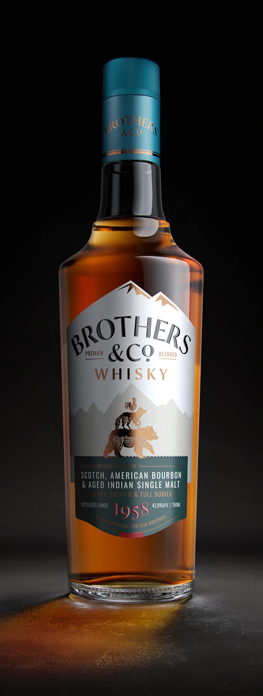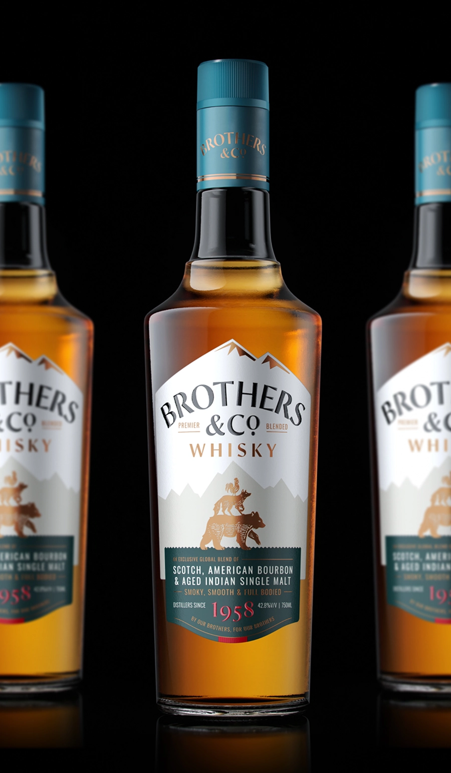
Brothers & Co.
By our brothers, for our brothers
The Brand: A premium blended whisky by Globus Spirits, positioned in a highly competitive category, dominated by decades old legacy brands.
The Challenge: Globus Spirits operates on the belief that growth is achieved by delivering products that exceed category expectations. This ambition is realised in the liquid through a carefully balanced blend of Scotch, Bourbon, and aged Indian single malt. The objective for the packaging was to deliver a comparable sense of elevation, while working within the constraints of a price-sensitive category.
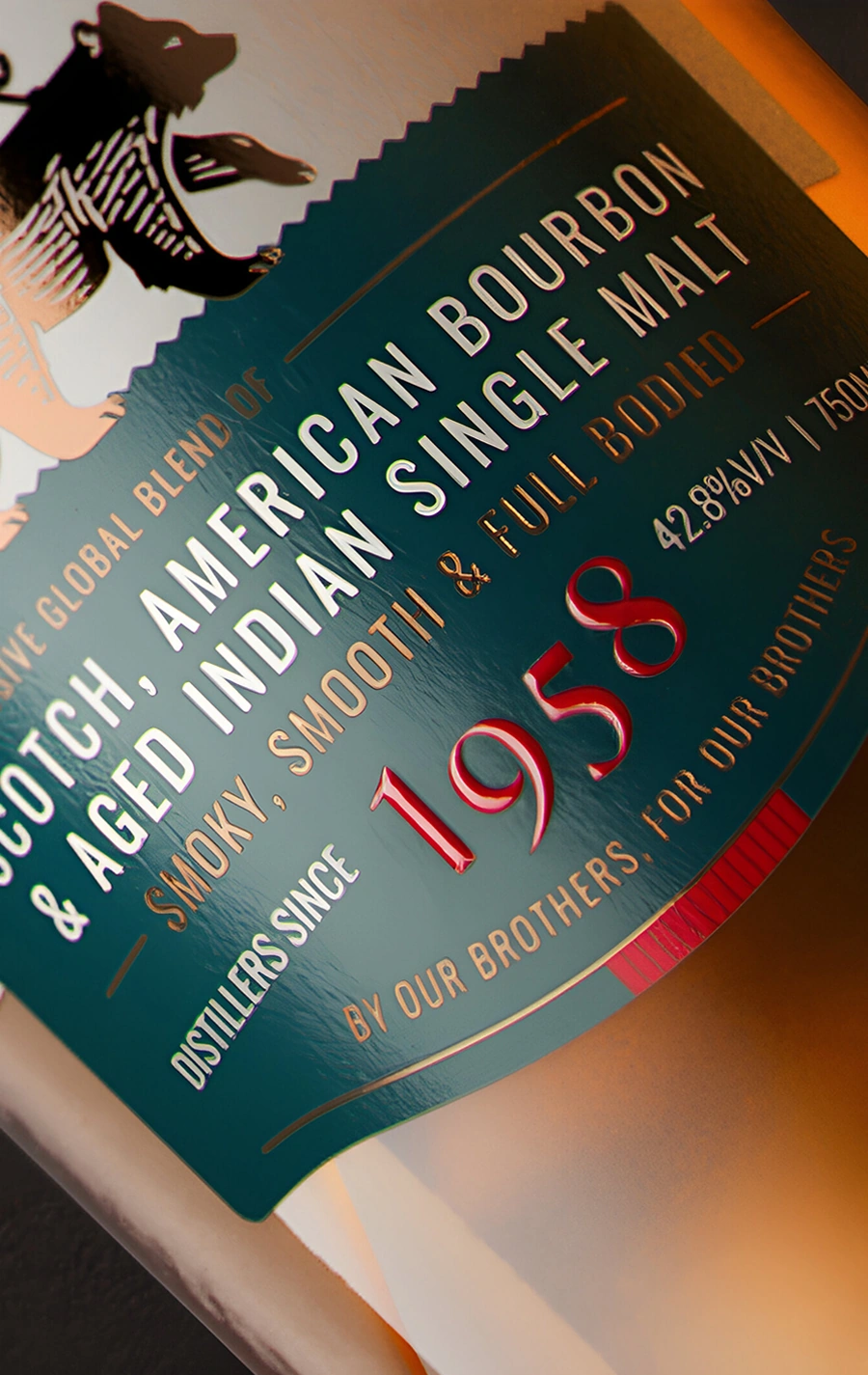
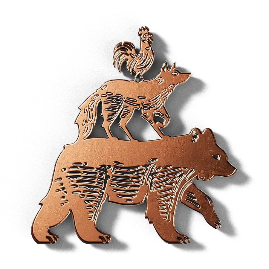
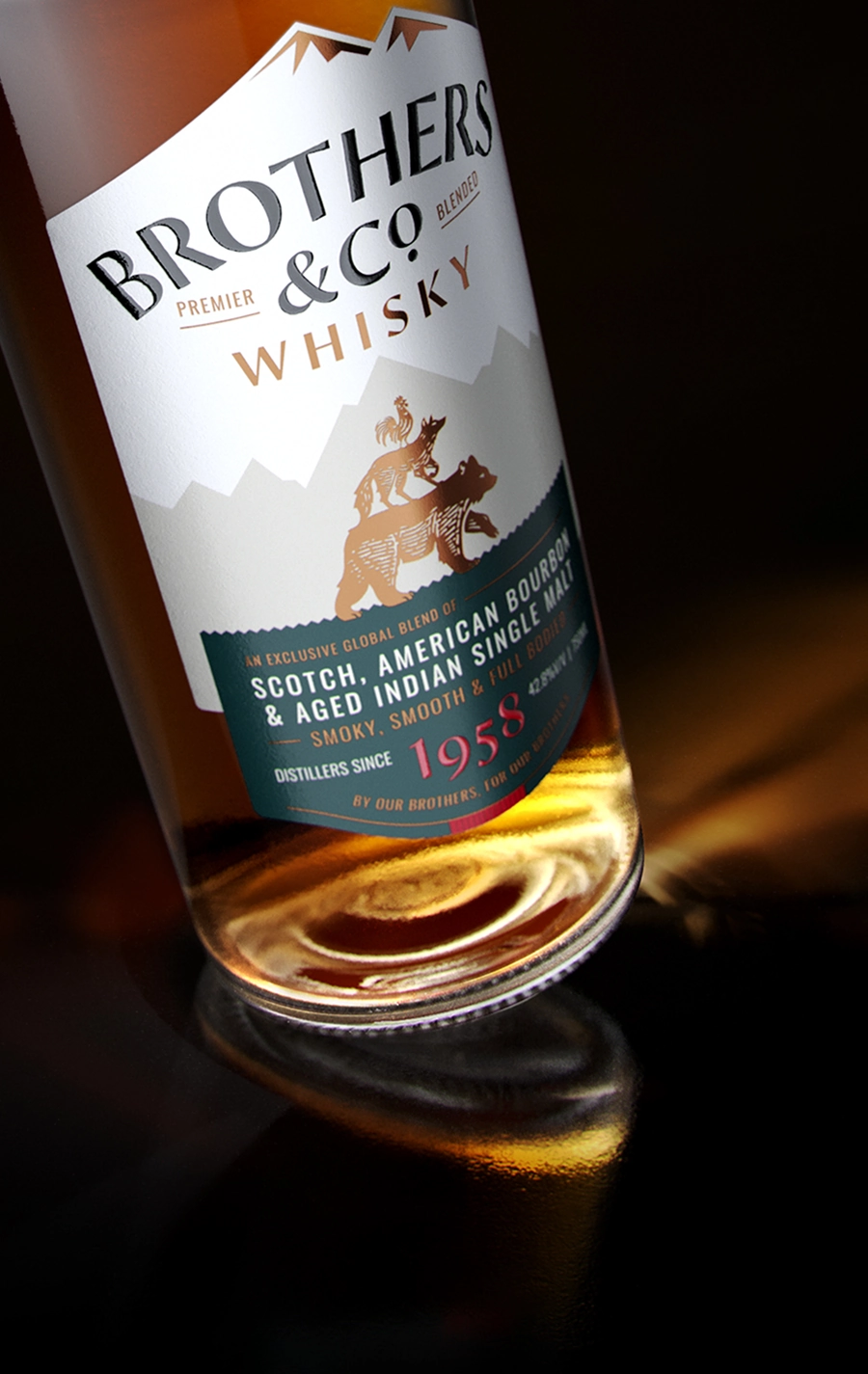
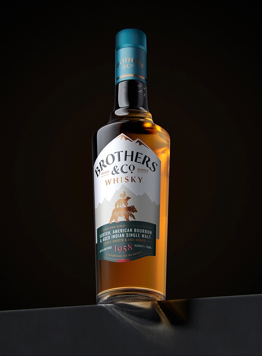
Design: The design deliberately rejects the norm of relying on familiar signifiers such as royal crests and ornamental ribbons. In their place, it introduces narrative as a strategic device. The name Brothers & Co. becomes the foundation for the brand's visual language, expressing ideas of camaraderie, kinship, and shared experience. This is brought to life through the emblem of 'The Wild Friends', rendered with a folk-tale quality that invites curiosity and encourages interpretation. Structural and informational cues are borrowed from higher-end international whiskies, particularly through the secondary lower-label where detailed information respects the viewer's discerning ability.
Read LessBranding / Print / Packaging
Collaborators:
Amit Chippa (3D Visualisation)
Team:
Shikhar Rustagi, Suvendu Sekhar Das, Hanumant Khanna