Better Urgent Care for every New Yorker
Branding / Print / Digital
Collaborators:
Ayush Kasliwal (Advisor), Sofie Kanpuriya (Copy and Tone)
Team:
Kriti Monga, Bhavika Aggarwal, Hanumant Khanna
The Company: Nao Medical is a chain of Urgent Care clinics across New York — a walk in medical practice that aims to bridge the gap between emergency and primary care.
The Premise: Before approaching QBF, the Nao Medical team already had a thriving practice under a different name. At a stage where they were set for a large expansion, they took the opportunity to understand how to fully tap the potential of their visual communications to express their values, be distinct, and build richer relationships with local communities. A ground-up strategic exercise looked at every aspect of the brand - from the name and tone of voice, to the visual language across all brand touchpoints.
Strategy and Design: The name 'Nao' speaks of an immediacy, as well as a present-continuous relevance. The short, simple name permits for some play with the written word in the brand's communication, making it fun and memorable. The tone of voice is respectable, authentic and transparent — defined by us for various communication instances in a detailed brand manual. The visual language is bright, yet soothing — a friendly and inviting alternative to the usually cold, sanitized distance associated with medicine.
Today: Nao Medical has opened 16 clinics across New York with a larger plan to open many more in the city. They are quickly becoming the most visible urgent care practice, trusted and loved by local communities.

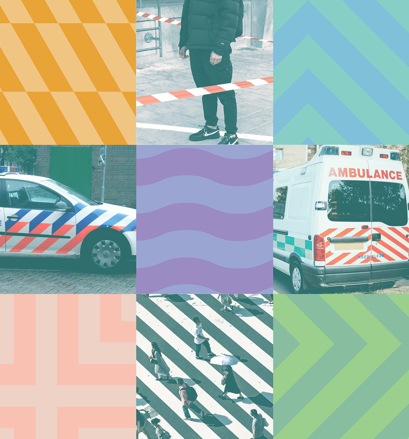
A series of striped patterns hint at a visual tool used by other emergency services and signs to catch a viewer's eye. The softer pastel shades make them more friendly and inviting, while also establishing a unique brand colour palette.
The symbol borrows from the well-known Star of Life, a mark of emergency services in America. It also hints at a guiding compass and the stern of a ship - steering their patients across rough waters to better shores.
A series of striped patterns hint at a visual tool used by other emergency services and signs to catch a viewer's eye. The softer pastel shades make them more friendly, while also establishing a unique brand colour palette.
The symbol borrows from the well-known Star of Life, a mark of emergency services in America. It also hints at a guiding compass and the stern of a ship - steering their patients across rough waters to better shores.
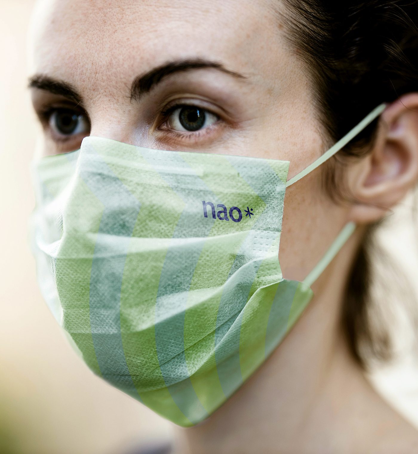
A series of striped patterns hint at a visual tool used by other emergency services and signs to catch a viewer's eye. The softer pastel shades make them more friendly and inviting. The symbol borrows from the well-known Star of Life, a mark of emergency services in America.


