The Idea:
Conceived through a deep strategic partnership with the founder, the project sought to articulate a clear
ethos for a new generation of discerning Indian whisky consumers. Grounded in decades old distilling expertise
and inspired by the breadth of grains, techniques, and finishing processes found across India and the world,
each Dōaab expression is crafted to deliver a distinct point of view.
The Design:
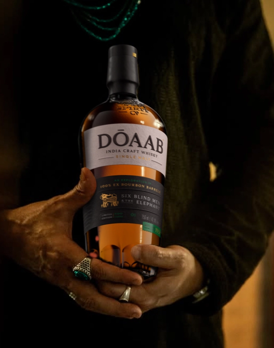
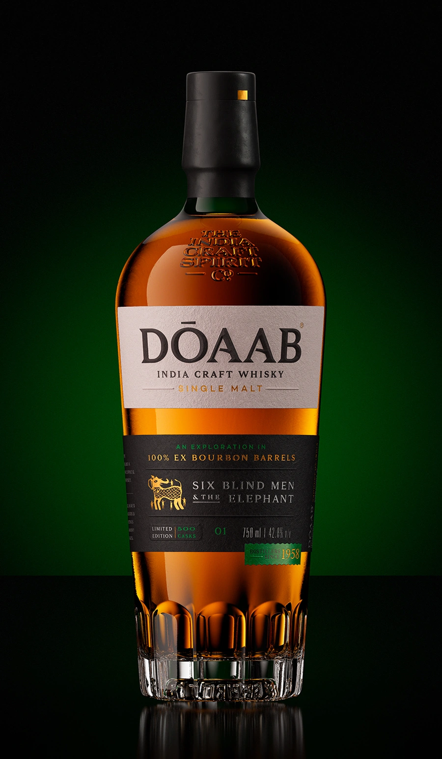
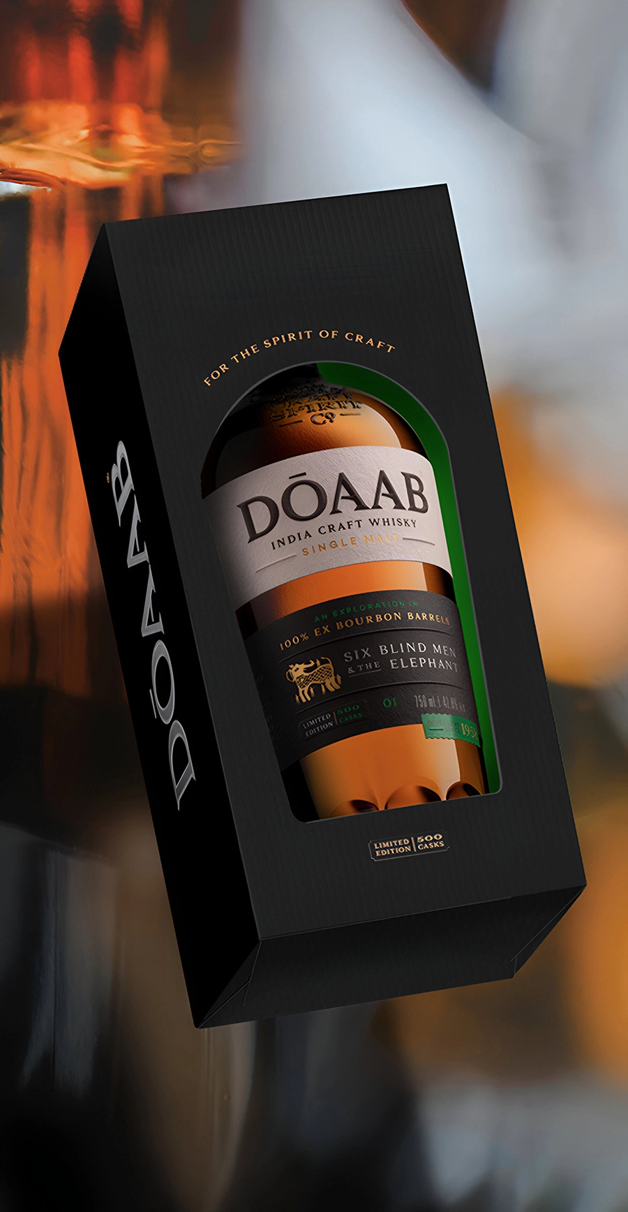
The philosophy is expressed through packaging that draws from the wisdom of timeless fables, selecting
a narrative rooted in the specific geography that inspires the whisky. Each expression is a story—to be
explored, interpreted, and savoured. A dual-label system unites the series: a consistent upper label
establishes continuity, while a changing lower label distinguishes each variant.
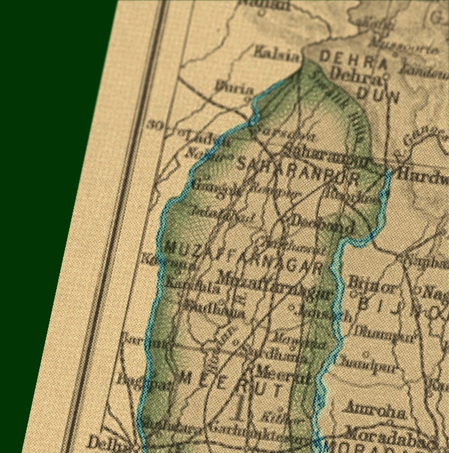
A fond reference to the alluvial plains between the Ganga and Yamuna rivers where the founders,
the Swarups, have a familial connection to the land and its history.
The name also hints at the brand's belief that the most fertile ideas come from the unexpected confluence
of two different streams of perspectives. Each Dōaab whisky is shaped by this intermingling across geographies,
techniques and flavours.
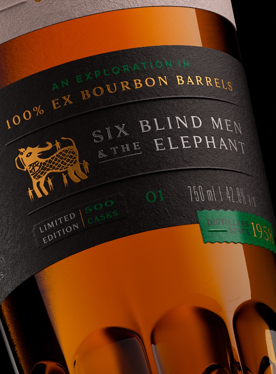
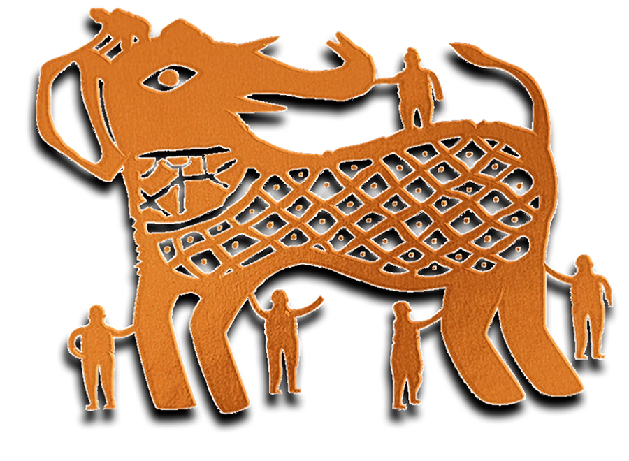
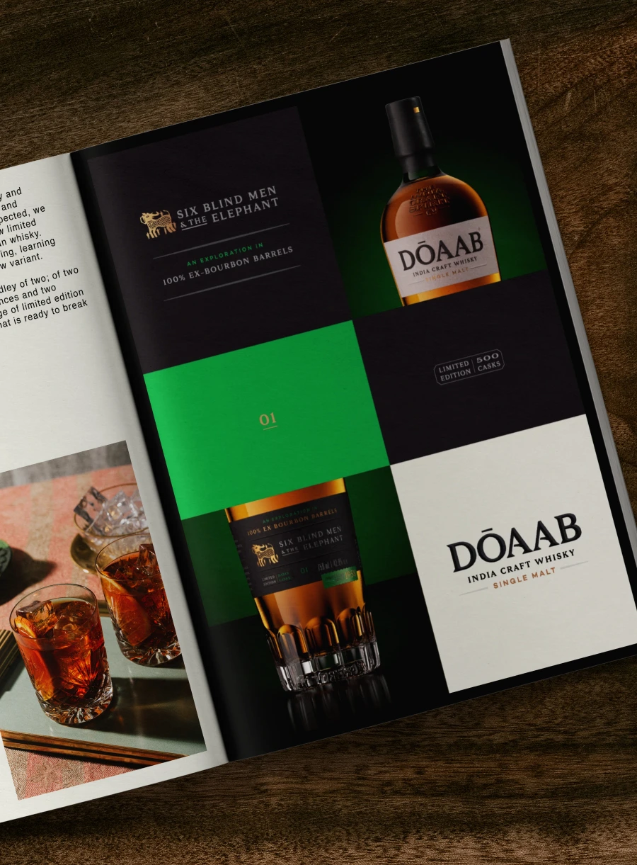
Six Blind Men & The Elephant
An ancient Indian parable that has long stirred the minds of philosophers, spiritual seekers, and poets across
the world.
Reimagined through this whisky, the tale becomes an ode to the thinkers, creators, tinkerers, and makers who
each lend their own perspective to craft this single malt—a whisky greater than the sum of its parts. On the bottle,
a little symbol inspired by Mandava art from Rajasthan illustrates the story.
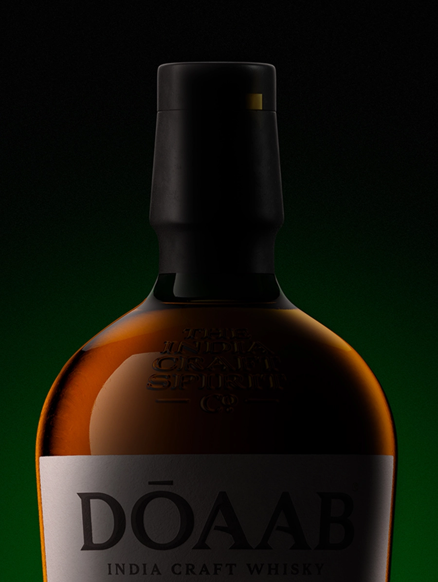
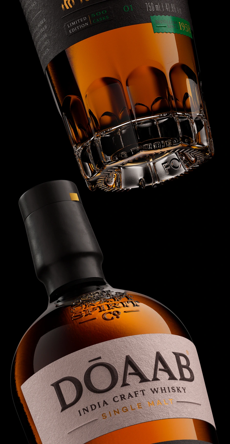
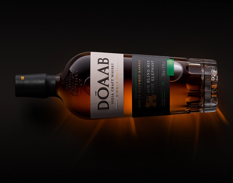
The Bottle
The bespoke Dōaab bottle was the outcome of a conversation with the founder—"Let it feel
right for the category, and yet just odd enough to be memorable. Let it be elegant, and yet imperfect
enough to feel right for a good whisky." The scalloped foot, rounded shoulders and snubbed neck attempt
to find that balance. A modern bottle with a classic essence.