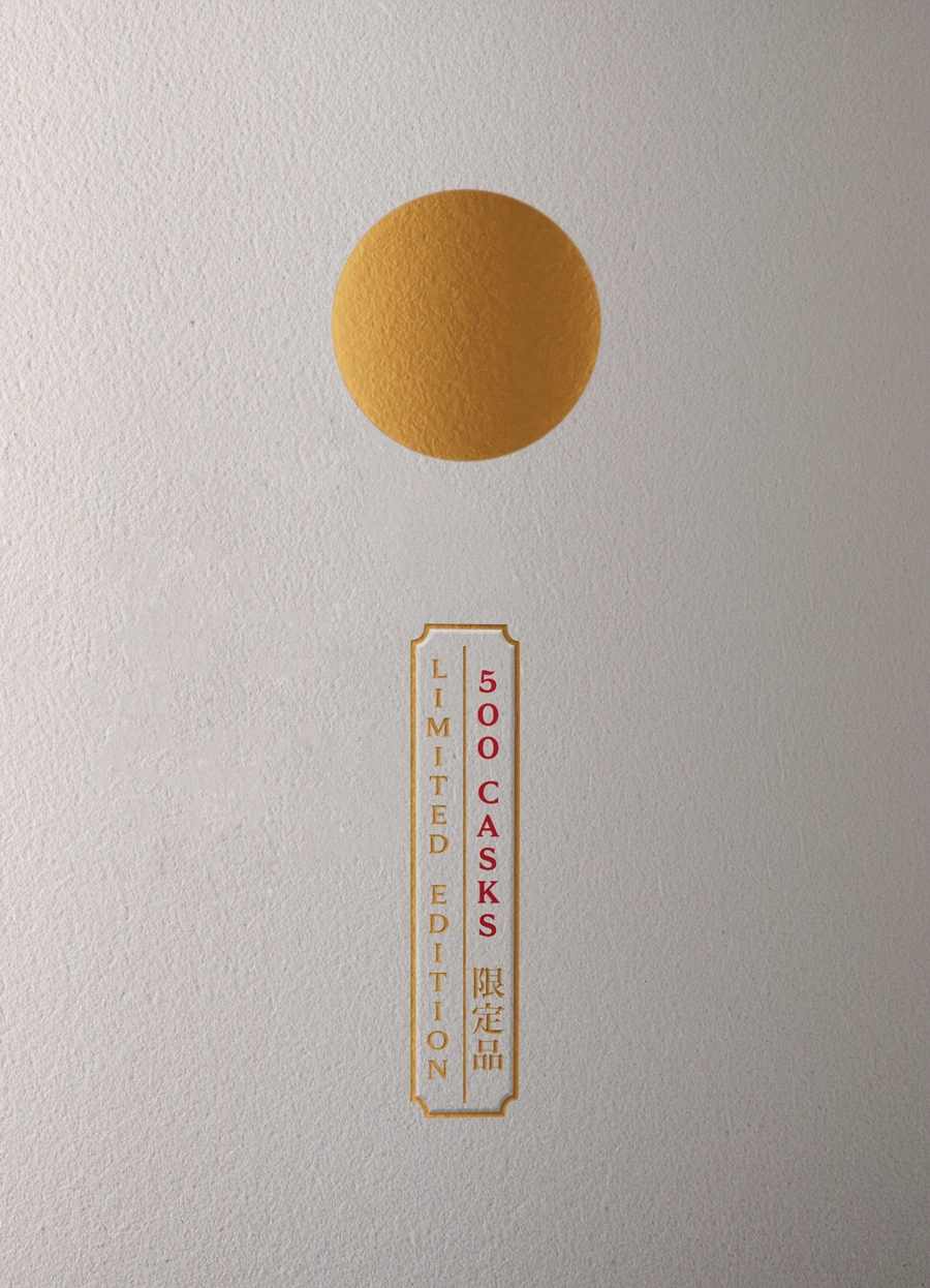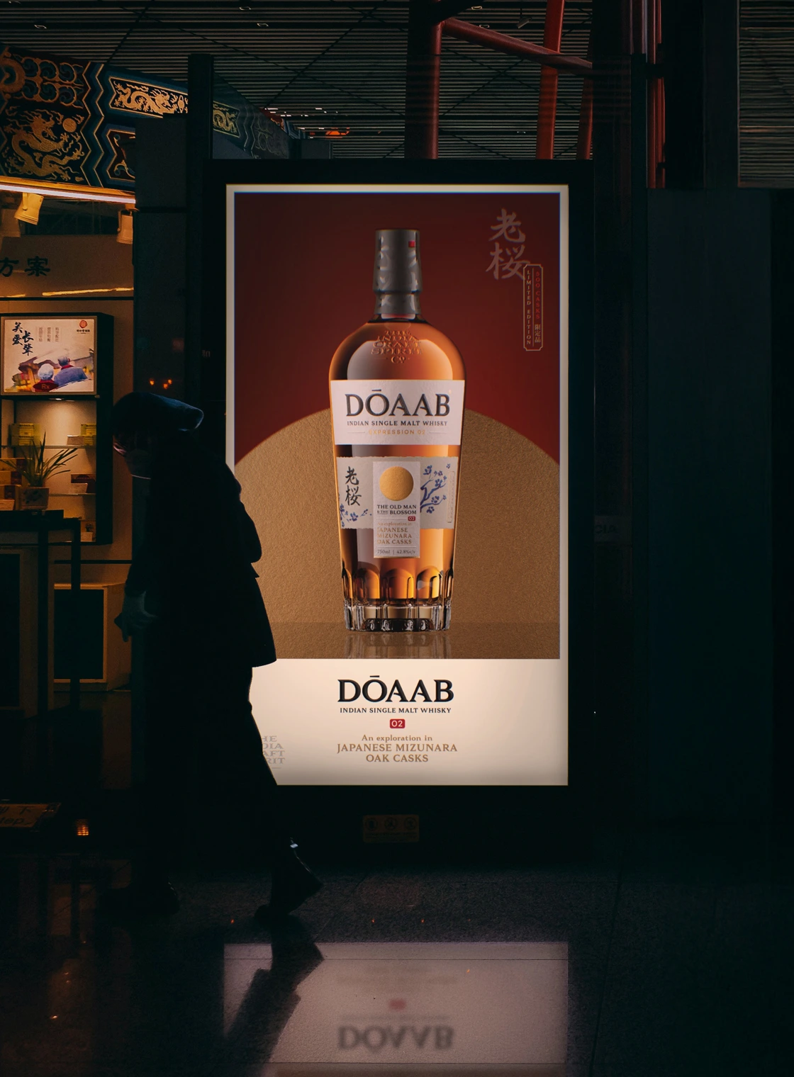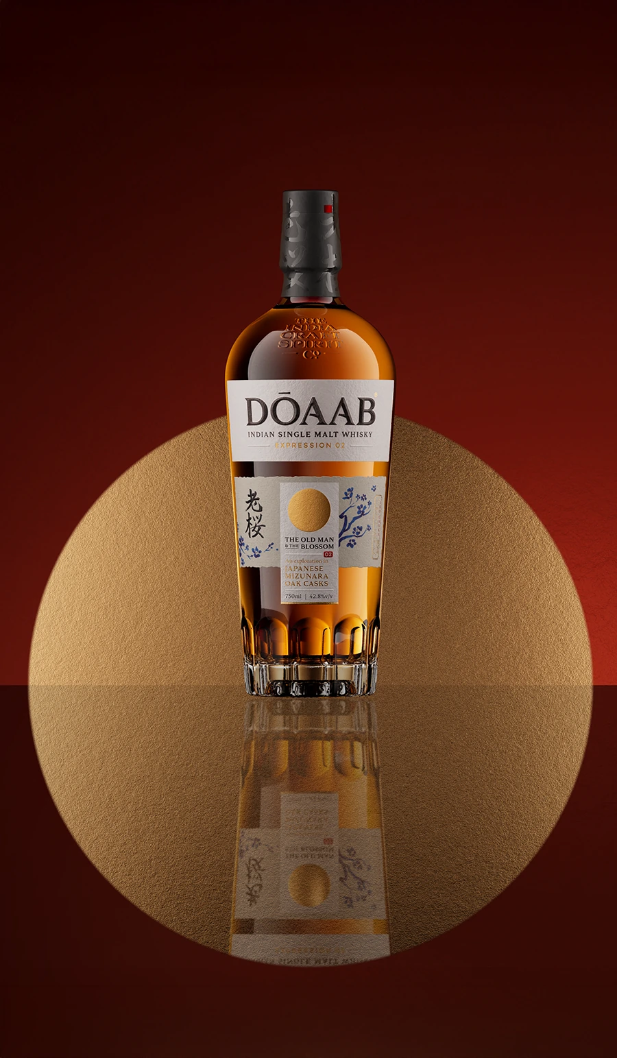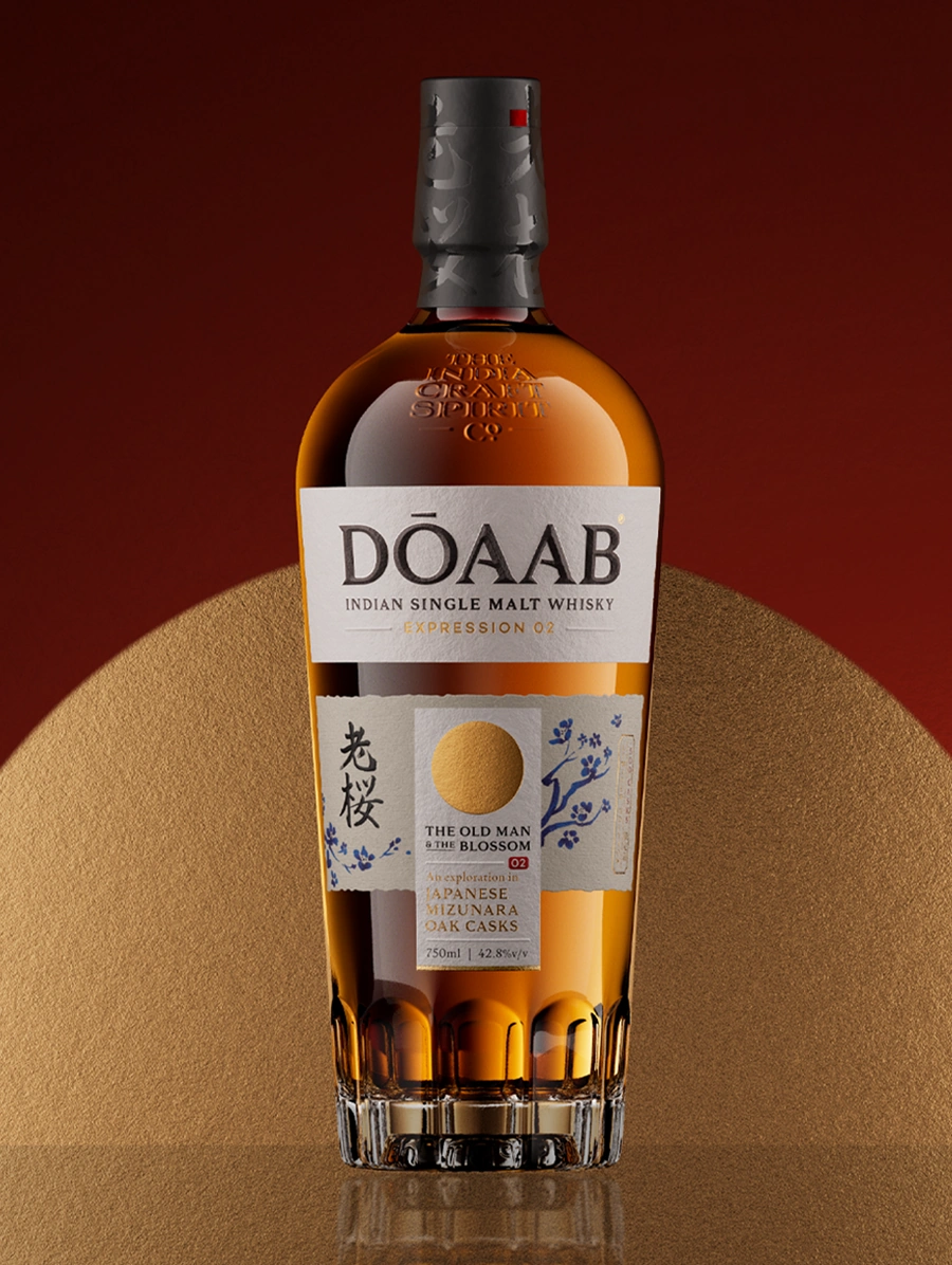
Dōaab 02
A whisky blossomed from seasons past
The Brand: Dōaab is a contemporary range of limited-edition Indian whiskies, born of a spirit of exploration and experimentation. The Hindustani name translates to "The land between two rivers". It reflects the brand's core belief that the most fertile ideas come from the unexpected confluence of different streams of perspectives. Dōaab whisky is shaped by this intermingling across geographies, techniques and flavours.
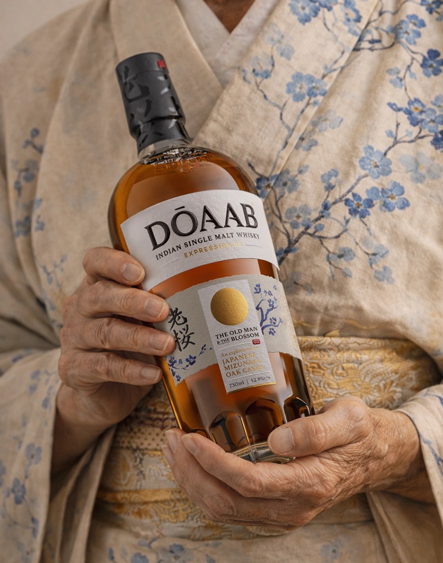
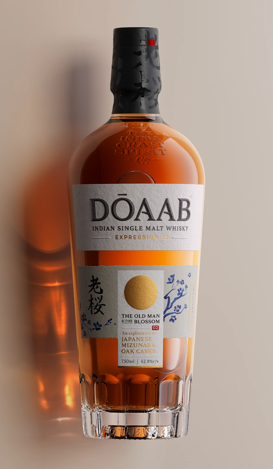
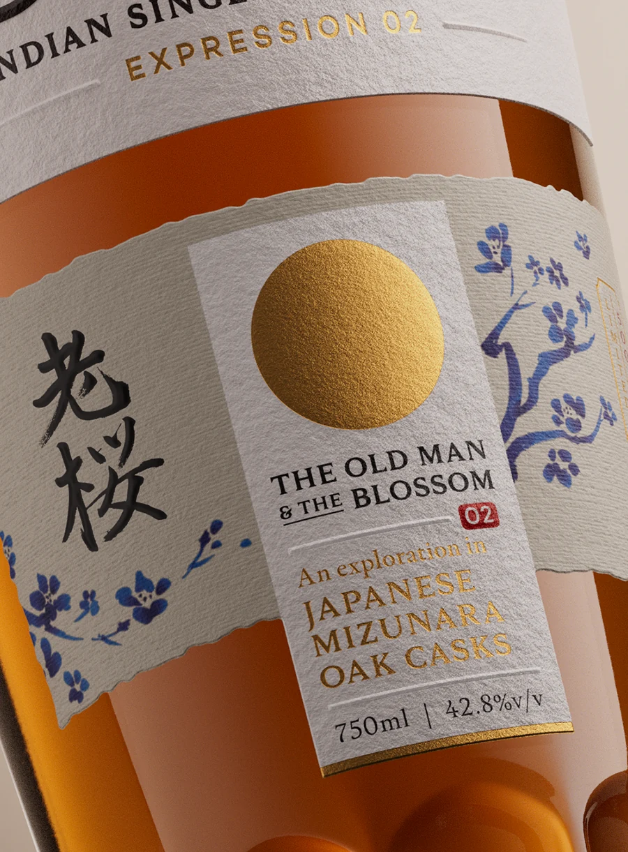
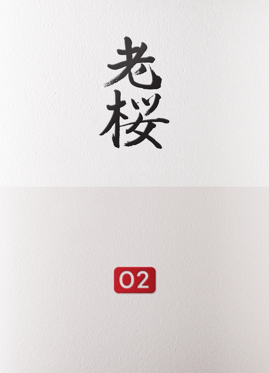
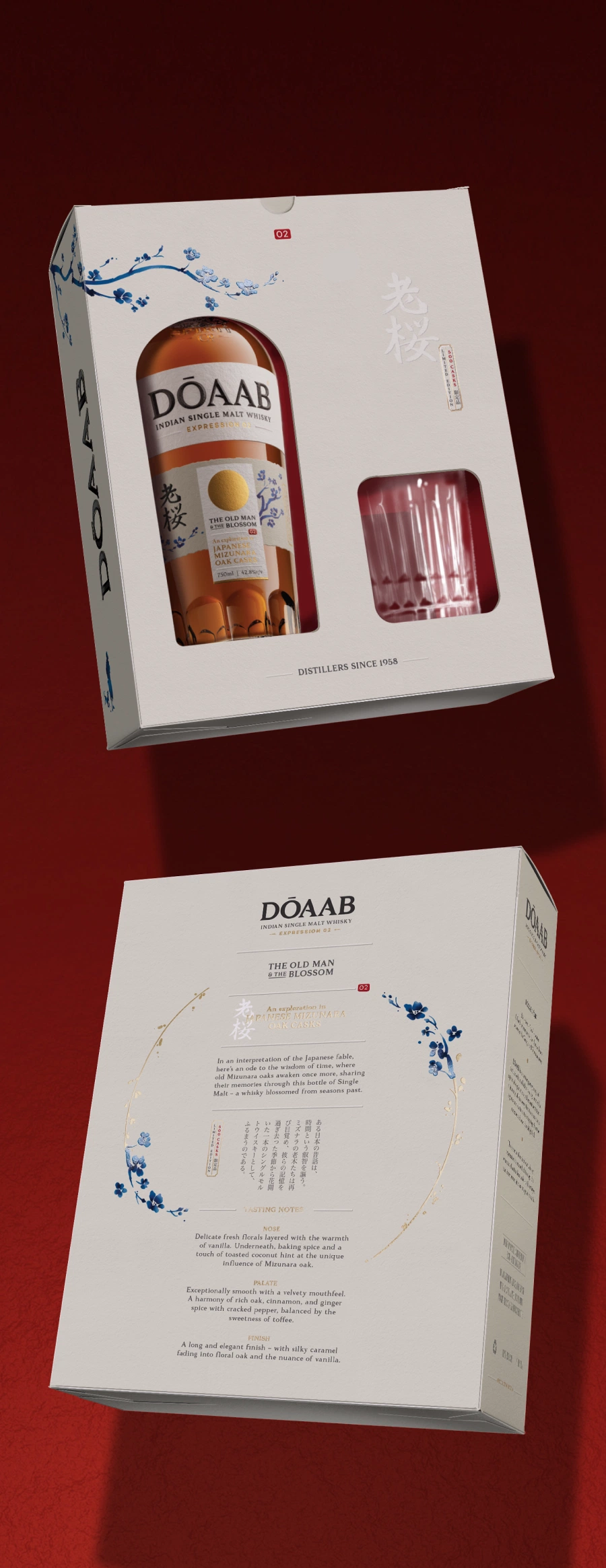
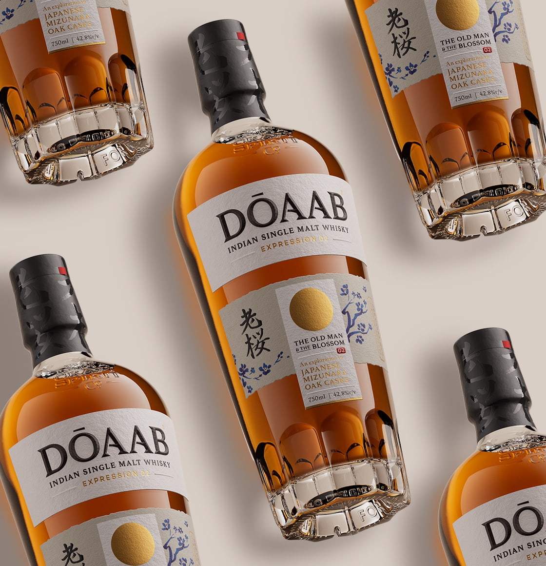
The Series: Each variant of Dōaab draws from the wisdom of a timeless fable, anchoring its narrative in the specific geography that inspires the liquid itself. This second expression explores Indian six-row barley malt matured in Mizunara oak casks, a maturation style traditionally associated with Japanese whisky-making. A classic Japanese fable is reinterpreted to tell the story on the label.
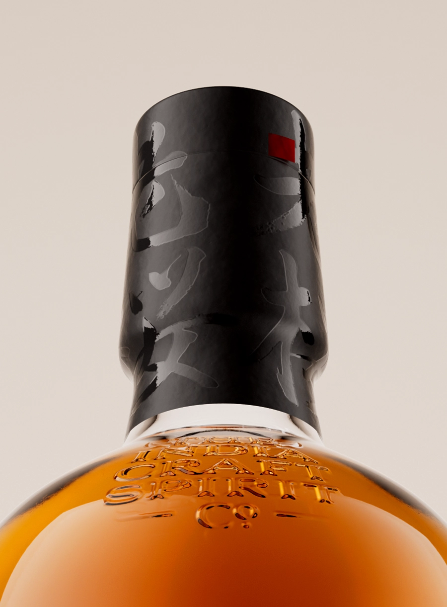
The Design: An Indian whisky crafted with authentic Japanese ingredients and techniques presents a compelling duality. It was essential that the Japanese influence be immediately legible to an Indian audience. The design embraces a restrained aesthetic, guided by minimal yet evocative materials, considered print finishes, and carefully selected papers. Recognisable Japanese symbology is subtly woven throughout the label and packaging, creating a visual language that is both respectful and distinctive.
Read LessStrategy / Naming / Branding / Print / Packaging / Illustration
Collaborators:
Yuriko Lochan (Japanese calligraphy and translation), Tricycle Studio (3D Visualisation)
Team:
Vinit Gaikwad, Suvendu Sekhar Das, Sachin Bhatt, Hanumant Khanna