A whisky blossomed from seasons past
Strategy / Naming / Branding / Print / Packaging / Illustration
Collaborators:
Yuriko Lochan (Japanese calligraphy and translation), Tricycle Studio (3D Visualisation)
Team:
Vinit Gaikwad, Suvendu Sekhar Das, Sachin Bhatt, Hanumant Khanna
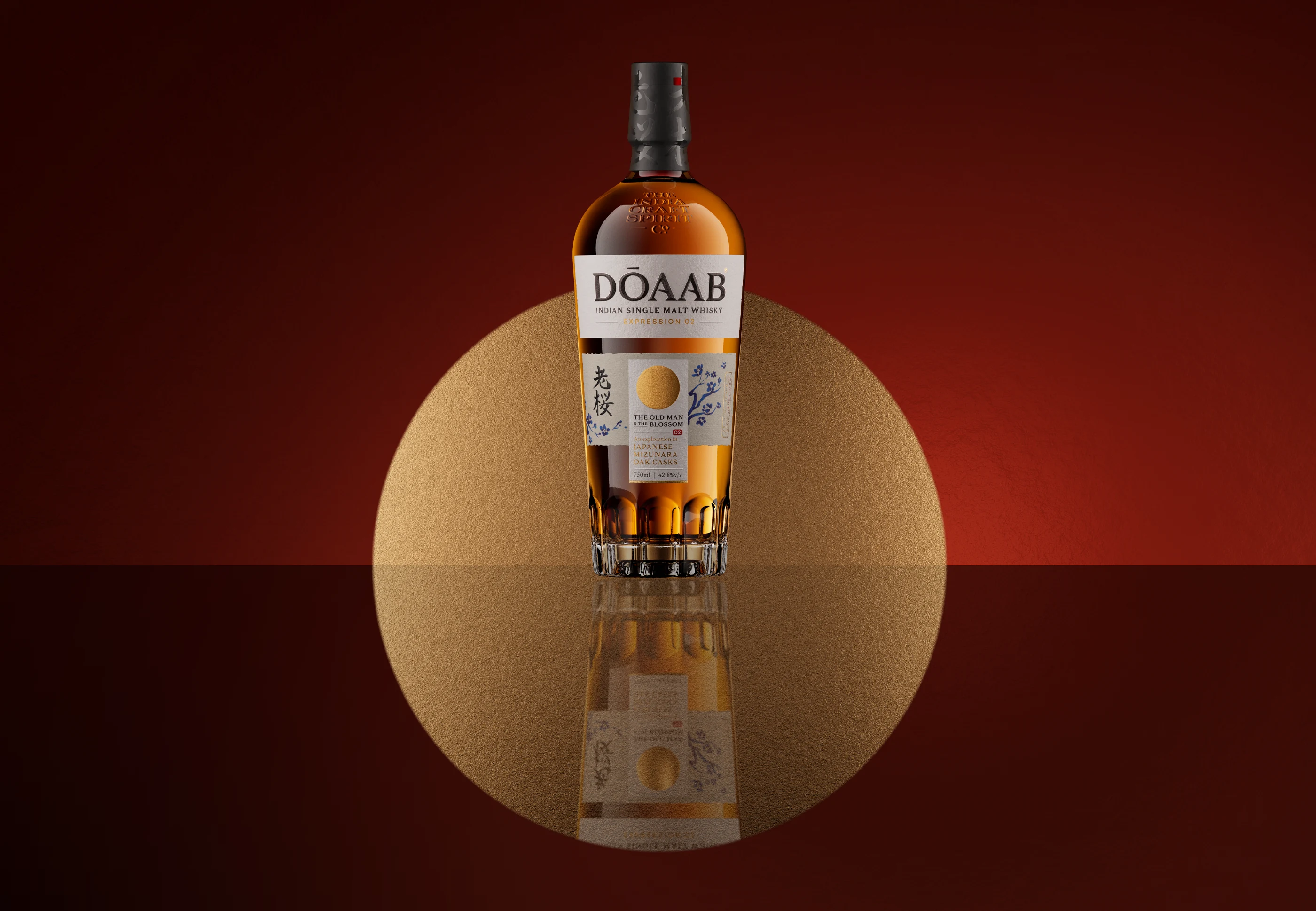
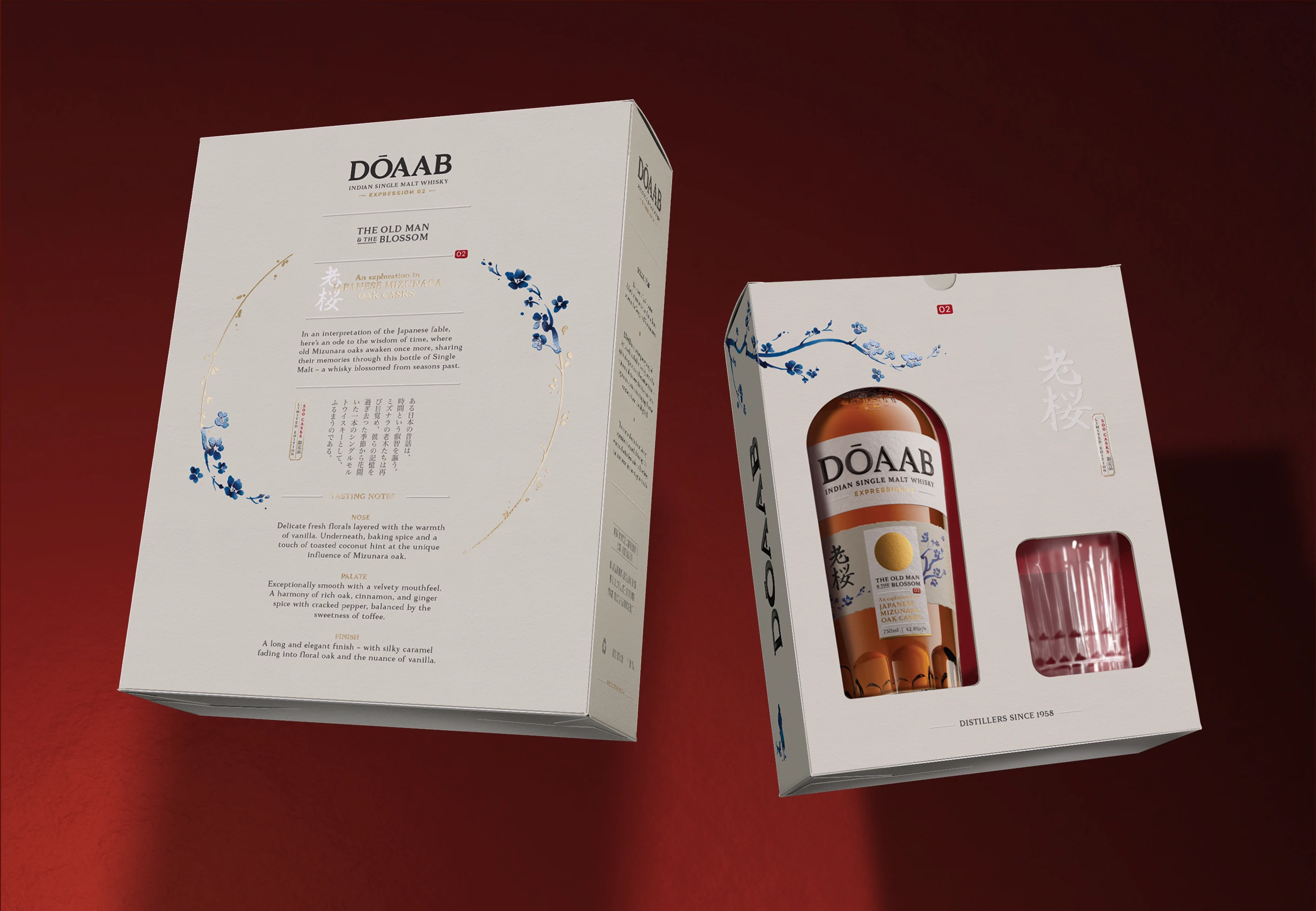
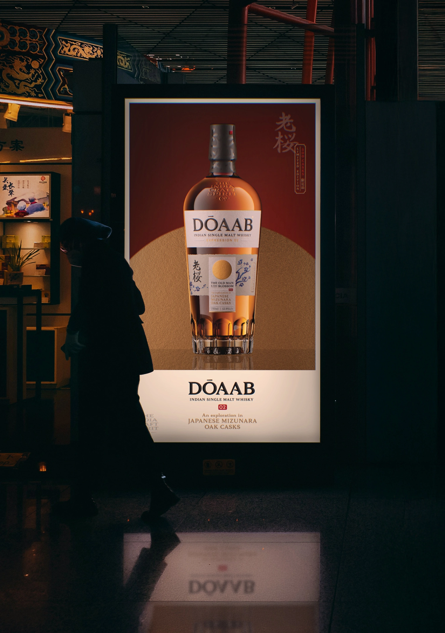
The Brand: Dōaab 02 is a contemporary range of limited-edition Indian whiskies, born of a spirit of exploration and experimentation. The Hindustani name translates to "The land between two rivers". It reflects the brand's core belief that the most fertile ideas come from the unexpected confluence of different streams of perspectives. Dōaab whisky is shaped by this intermingling across geographies, techniques and flavours.
The Series: Each variant of Dōaab draws from the wisdom of a timeless fable, anchoring its narrative in the specific geography that inspires the liquid itself. This second expression explores Indian six-row barley malt matured in Mizunara oak casks, a maturation style traditionally associated with Japanese whisky-making. A classic Japanese fable is reinterpreted to tell the story on the label.
The Design: An Indian whisky crafted with authentic Japanese ingredients and techniques presents a compelling duality. It was essential that the Japanese influence be immediately legible to an Indian audience. The design embraces a restrained aesthetic, guided by minimal yet evocative materials, considered print finishes, and carefully selected papers. Recognisable Japanese symbology is subtly woven throughout the label and packaging, creating a visual language that is both respectful and distinctive.
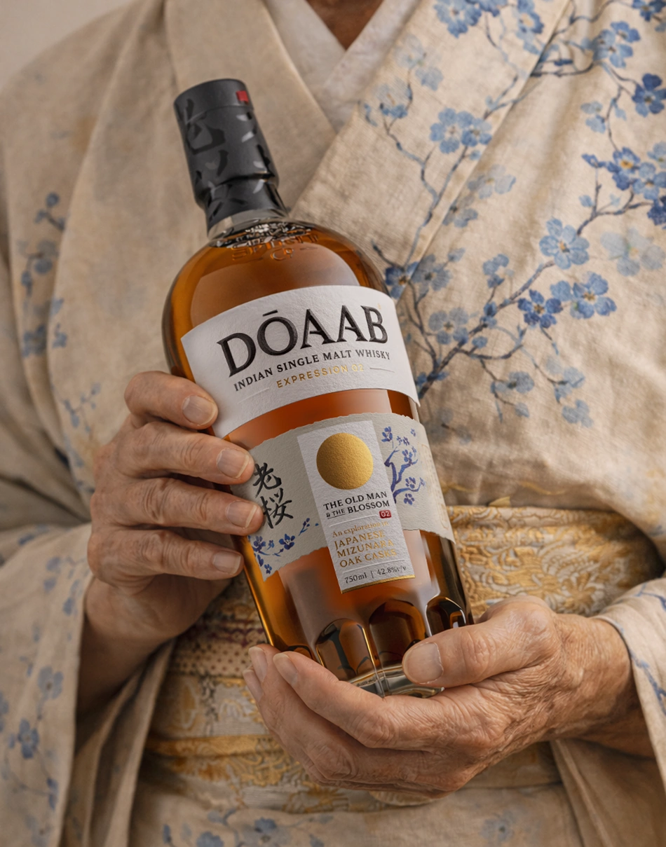
The classic Japanese folktale, Hanasaka Jiisan, is the story of a kind old man who gains the power to miraculously bring withered trees to blossom once more.
In an interpretation of this fable, the whisky becomes an ode to the wisdom of time, where aged Mizunara oaks awaken again to share their memories through this bottle of Single Malt—a whisky blossomed from seasons past.
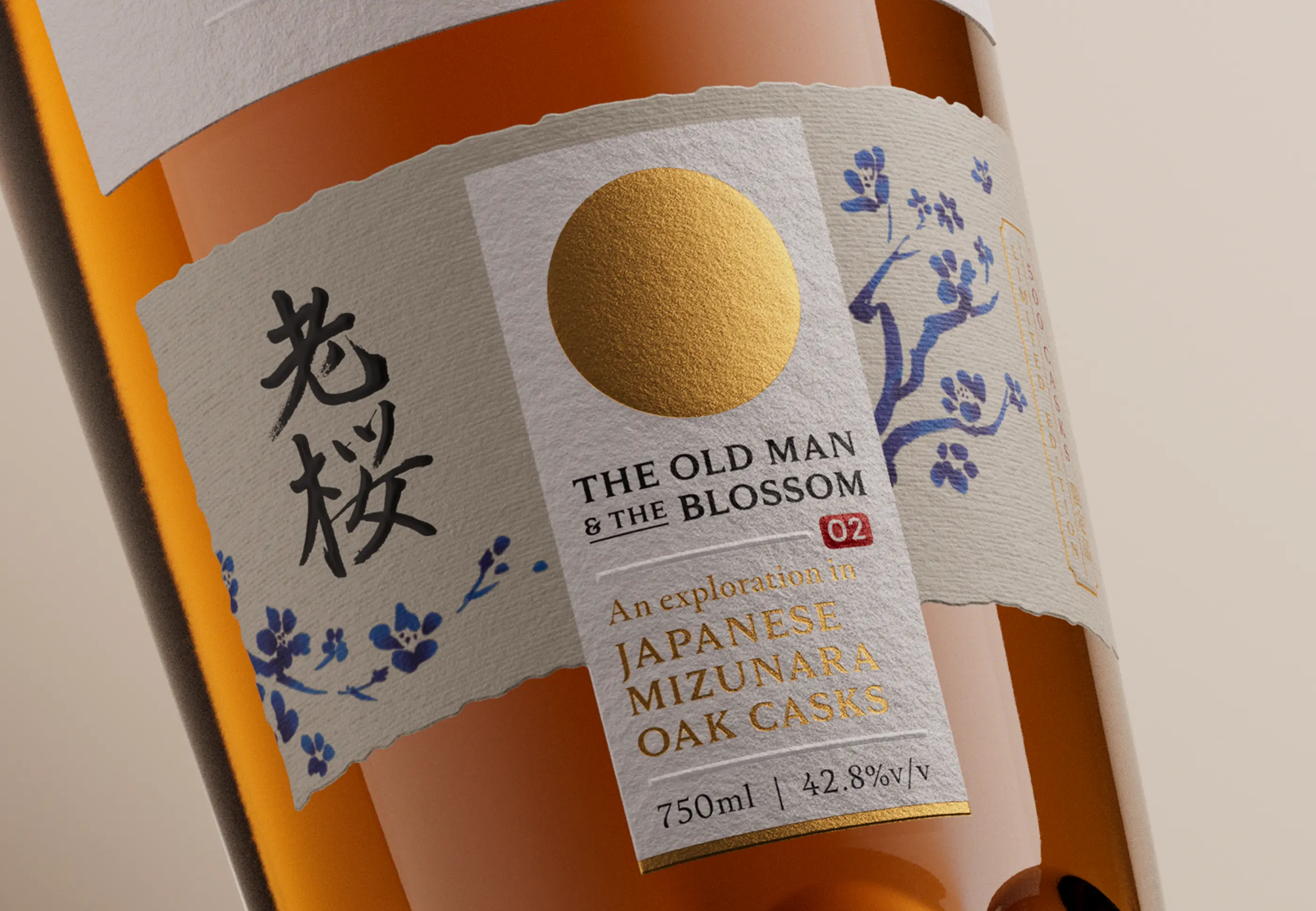
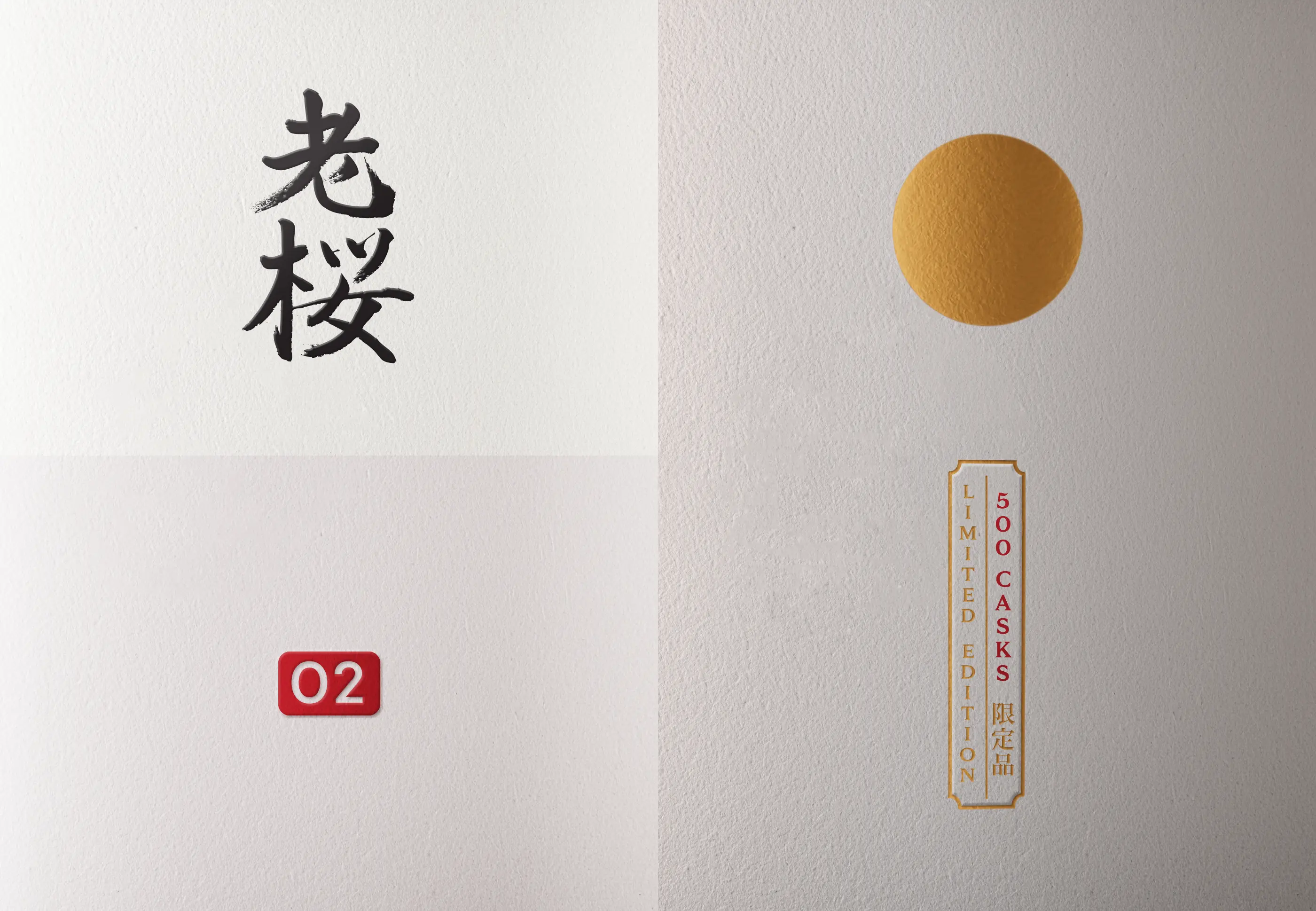
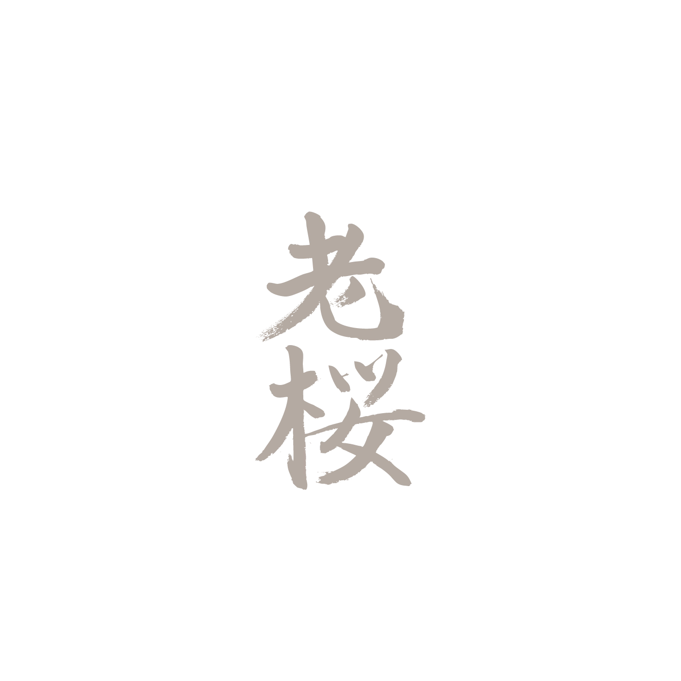
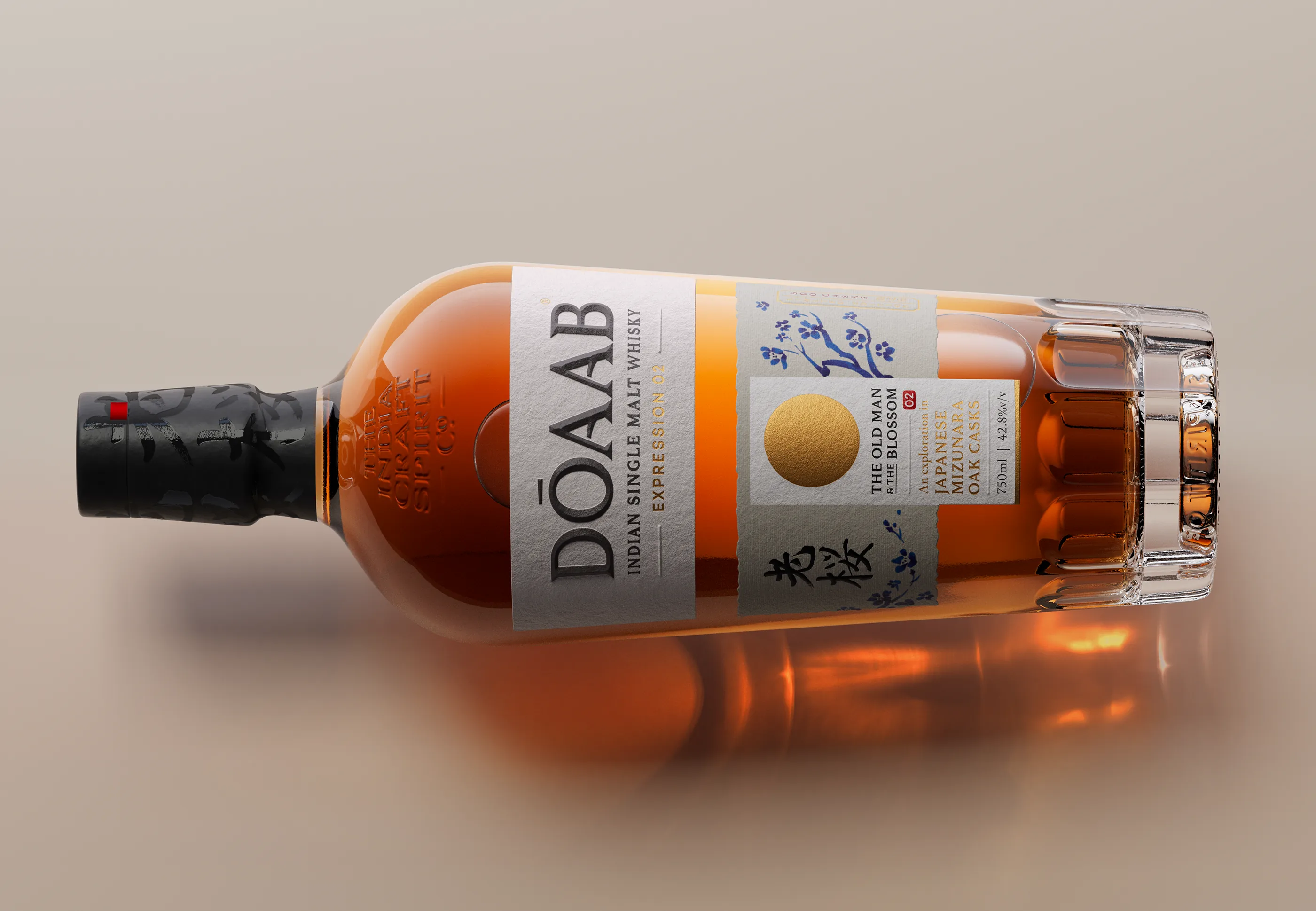
The Kanji
Rendered in expressive brushstrokes, the Kanji reads "Ozakura", or ancient cherry blossom tree—a common subject in
traditional artistic designs featuring Japanese calligraphy.
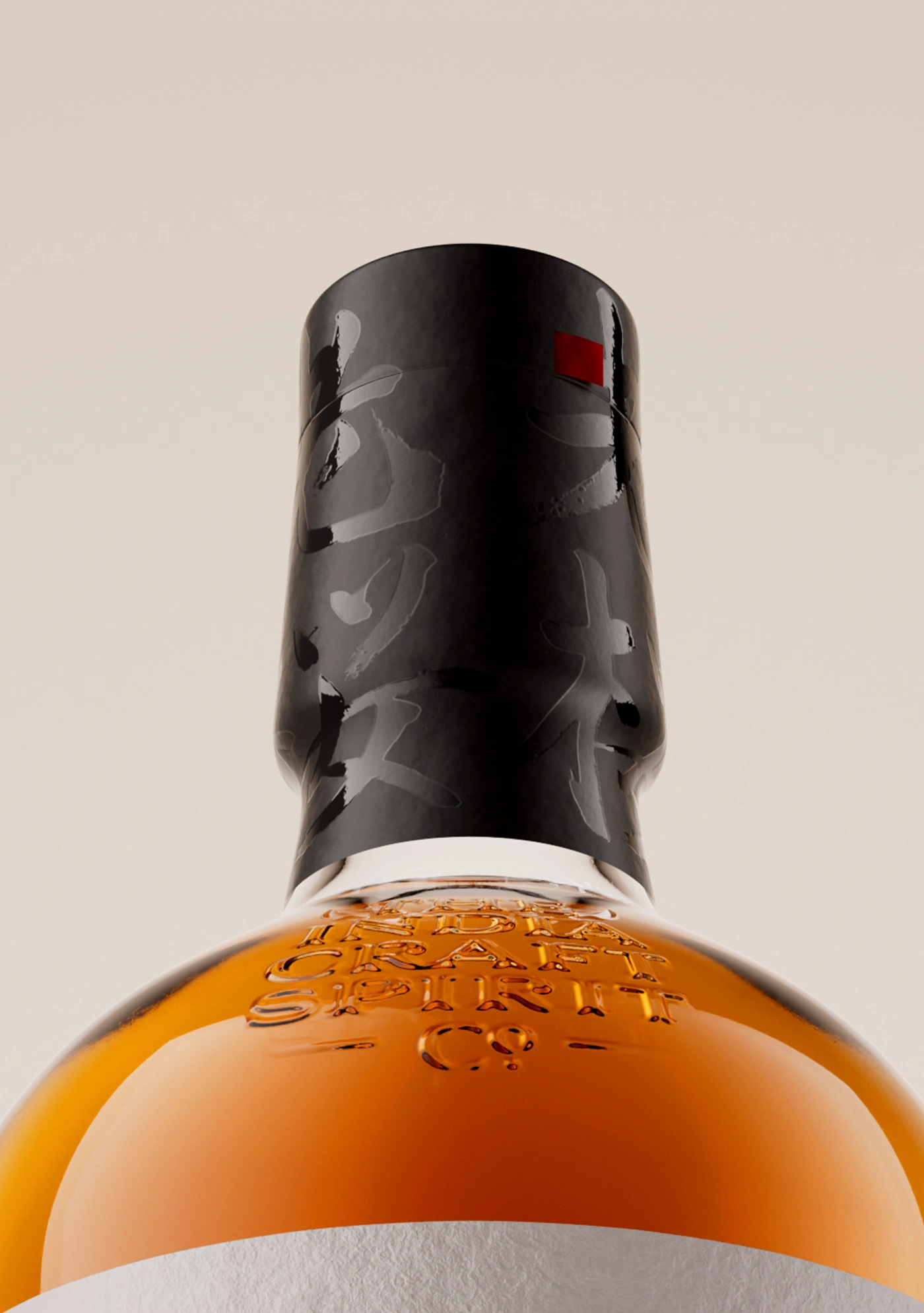
The calligraphy serves as the most immediate and powerful signifier of the whisky's Japanese narrative. At a glance,
it anchors the label in authenticity, communicating heritage, craft, and cultural influence with quiet confidence.
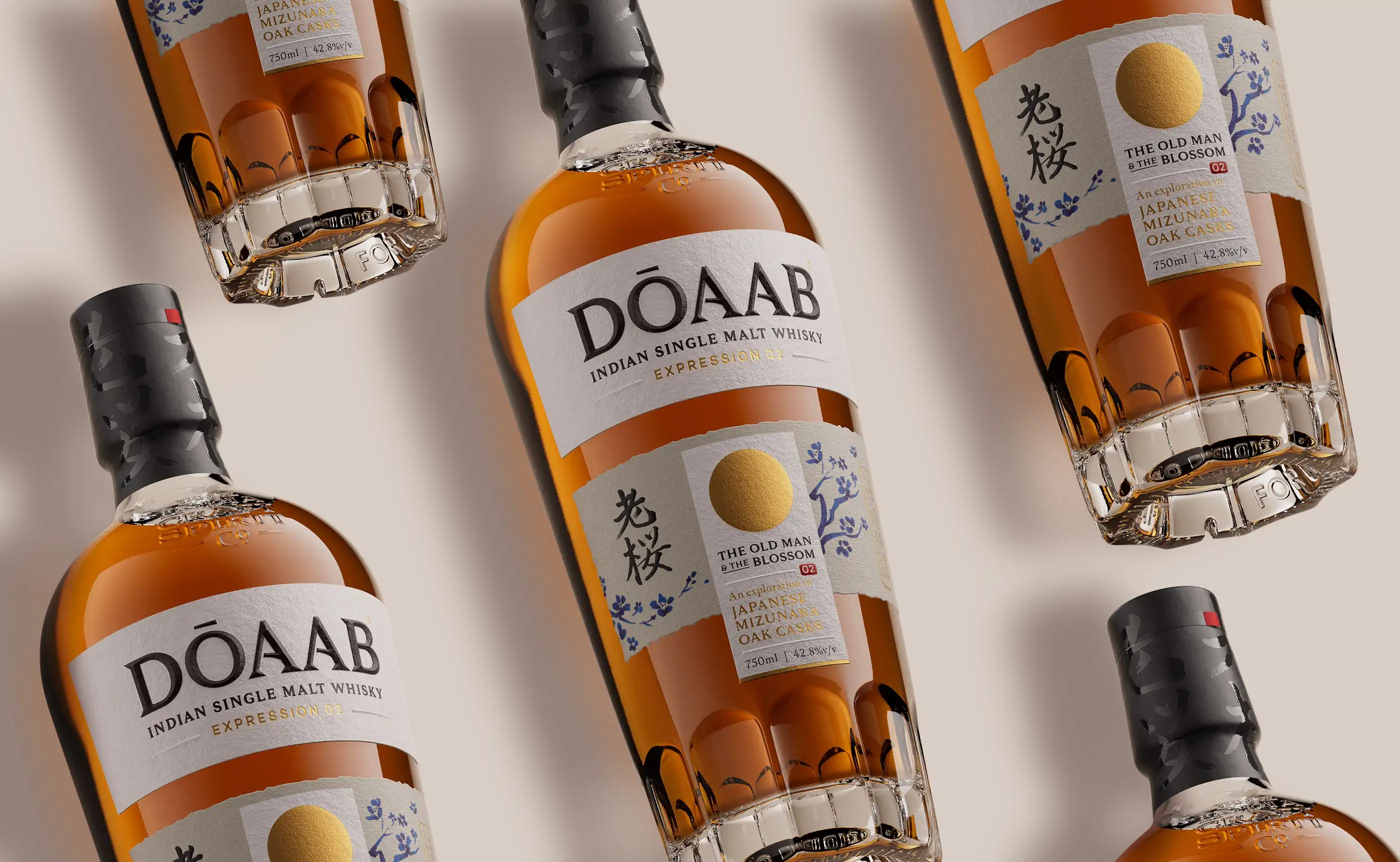
The simple circle, symbolising the sun, is one of Japan's most recognisable emblems. Prominently featured on the national flag, it carries deep mythological, historical, and geographical significance, embodying the country's identity and enduring cultural narrative.
The scroll, traditionally used for Japanese calligraphy, informs the structure of the whisky label. Its elongated format and sense of vertical movement bring a quiet reverence to the composition, grounding the design in tradition.