Art collections in the
palm of your hand
Branding / Digital / Print
Collaborators:
StruckBy (UI/UX)
Team:
Hanumant Khanna
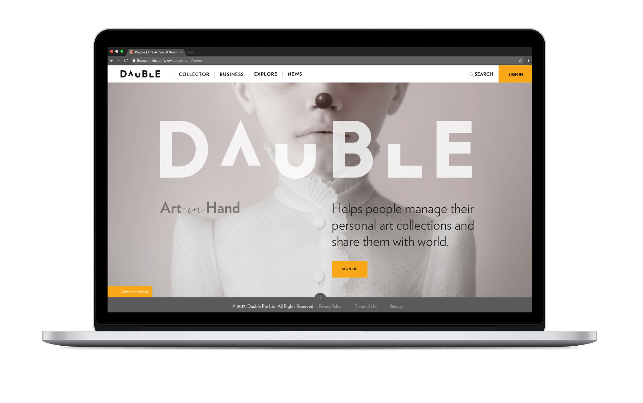
The Brand: Dauble is a web and app based platform that offers artists, collectors, galleries and art enthusiasts a professional online collection management system and social networking tool.
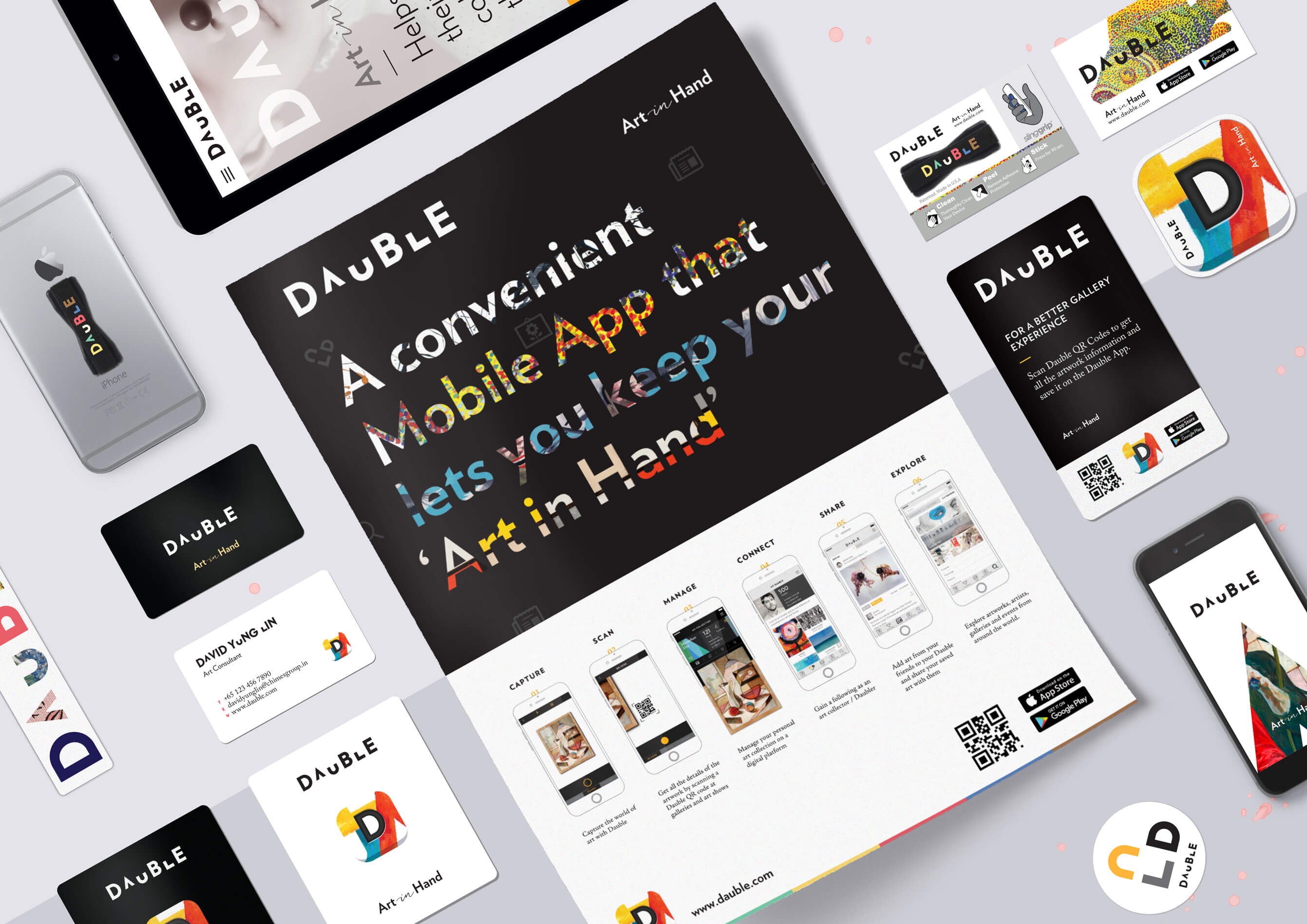
The Process: Invited to be a part of the project in its early conceptual phase, we saw the task extend beyond branding into brand strategy and product development. The project entailed working closely with the founders to develop a global identity and visual language, assisting in the development of the product, as well as identifying the right teams for other aspects of the project. Assuming the role of brand custodians, we helped guide the project to its launch at the Singapore Art Fair in 2016.
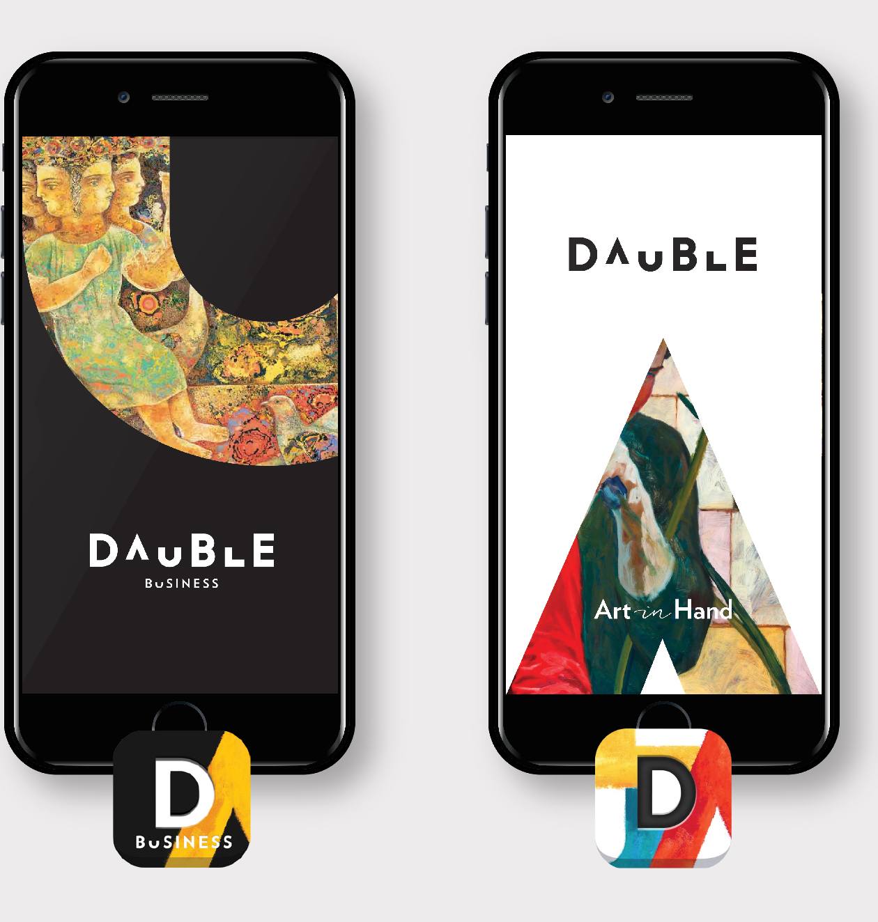
The Outcome: Dauble was the official 'Art App Partner' for the India Art Fair in January 2017. It has since launched 'Dauble Business', the professional version of the application, for galleries and artists.

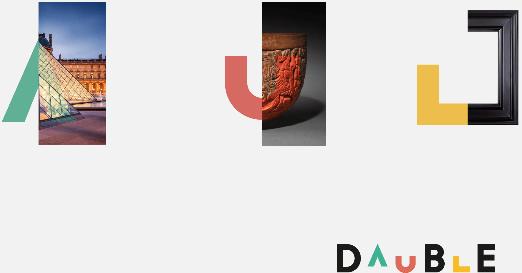
The name 'Dauble' is created from 'Daub', which means to coat or smear a surface with a thick substance like paint. The forms in the logo balance between being readable as letters and being seen as abstract art elements – the corner of a frame, the bowl of an ancient vase, a brush stroke on canvas or as part of a sculpture. The identity speaks of art collections in a fun and ever-evolving manner.

The tagline embodies the core idea behind the brand in a few words. 'Art in Hand' expresses the convenience of having all the details of our personal art collections, or the art we like, with us on our mobile app at all times – at hand/in hand.

Interacting with Art
The identity design leads the way to a clean and functional user experience for the Dauble Collector
and Dauble Business apps and website. The design is consciously restrained, allowing the art to
bring out the colour and vibrancy. The brand finds its voice through custom iconography, interactive
opening screens and the use of identifiable typography and colour.
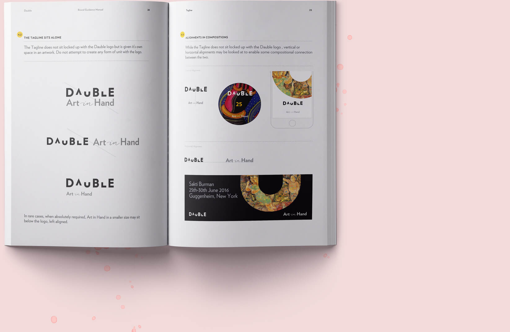
A detailed manual lays down the brand guidelines in digital and print form. The use of art as metaphor to highlight the sections across the pages of the manual remind us of the brand's primary focus.


